
Are you intrigued by the fascinating world of cryptocurrency and looking to visually decipher its price trends? Welcome aboard! In this comprehensive tutorial, we will explore creating color-coded line charts using Python and Matplotlib, a powerful tool for effective analysis of changes along a third dimension.
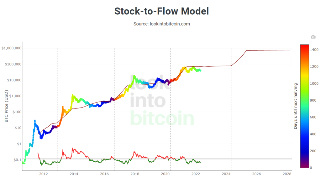
The past few years have witnessed a meteoric rise in the prices of cryptocurrencies, underscoring the need for accurate analysis and visualization of their price trends. An outstanding illustration of this is the color-coded Bitcoin stock-to-flow chart, a popular choice in the crypto space that uses color differentiation to denote time until the next Bitcoin halving event.
Drawing inspiration from this, our tutorial will guide you to create a similar dynamic color-coded line chart, tracing the price trends of two leading cryptocurrencies – Bitcoin and Ethereum. This visual aid will provide a deeper insight into their price trajectories over time, enabling you to make informed investment decisions.
As we dive in, we’ll break down the process into digestible chunks, making it easier for beginners to follow along. By the end of this tutorial, you’ll not only have a profound understanding of how to create and interpret such color-coded charts but also gain valuable insights into the world of cryptocurrency price trends.
Disclaimer: This article does not constitute financial advice. Stock markets can be very volatile and are generally difficult to predict. Predictive models and other forms of analytics applied in this article only illustrate machine learning use cases.
What are Color-coded Price Charts?
Color coding is beneficial for visualizing trading signals and statistical indicators in technical chart analysis. The idea of color-coding in chart analysis is to create visually comprehensible charts that let the user quickly interpret how price develops under certain conditions. A simple example is a candlestick chart, which uses color to signal whether the price moves up (green) or down (red). Candlestick charts visualize more as regular line charts, providing additional information on the opening and closing prices.
We can use color codings in line plots to visualize conditions of various types. We can derive them from the price itself and, for example, illustrate the price development independence of oscillation indicators or moving averages. Or they can be independent of the price and represent some other conditions, such as, for example, the spread of COVID-19 cases worldwide. These are just a few examples, and there are no limits to your creativity in choosing the conditions.
Also: Requesting Crypto Price Data from the Gate.io REST API in Python
Use Cases for Color-coded Price Charts
There are various use cases for color-coded line plots in the crypto space. For example, crypto enthusiasts employ them to visualize relationships between the price of bitcoin and statistical indicators, including momentum indicators such as the RSI. Color-coded line plots have also been used to show dependencies between price and specific events that develop parallel to the bitcoin price. For example, we can use color-coding to highlight the lag between the price and the bitcoin halving every four years.
Implementing Color-coded Price Charts in Python
Are you ready to elevate your data visualization skills and create visually striking price charts with Python? In this tutorial, we’ll be walking you through the creation of two dynamic line charts that use color to reveal intriguing trends and patterns. The first chart will feature a color overlay on the price line to showcase how Bitcoin prices fluctuate based on RSI. The second chart will unveil the shifting correlation between Bitcoin and Ethereum over time. Buckle up, and let’s dive in!
We’ll start by using the Coinbase Pro API to download historical price data on BTC and ETH. We’ll then calculate two well-established indicators in financial analysis: the Relative Strength Index (RSI) and the Pearson Correlation between Bitcoin and Ethereum. Finally, we’ll use Matplotlib to create stunning color-coded line charts that highlight the changes in the indicators over extended periods.
Also: Geographic Heat Maps with GeoPandas: Visualizing COVID-19
The code is available on the GitHub repository.
Prerequisites
Before starting the coding part, make sure that you have set up your Python 3 environment and required packages. If you don’t have an environment, you can follow this tutorial to set up the Anaconda environment. Also, make sure you install all required packages. In this tutorial, we will be working with the following standard packages:
In addition, we will be using the Historic-Crypto Python Package, which lets us easily interact with the Coinbase Pro API.
You can install packages using console commands:
- pip install <package name>
- conda install <package name> (if you are using the anaconda packet manager)
Step #1 Load the Price Data via the Coinbase API
We begin by downloading the historical price data on Bitcoin (BTC-USD) and Ethereum (BTC-USD) from Coinbase Pro. Don’t worry; you don’t need to download the data manually. Instead, we will use the Historic_Crypto Python package to access the data via an API.
Accessing the data via the Coinbase Pro API requires us to specify several API parameters. We define a frequency of 21600 seconds so that we will obtain price points on a 6-hour basis. In addition, we define a from_date of “2017-01-01” and add “ETH-USD” and “BTC-USD” to a list of coins for which we want to obtain the historical price data.
We query the API separately for each of the two coins in our coin list. Depending on your internet connection, this can take several minutes. The response contains three different price values:
- high: the daily price high
- low: the daily price low
- close: the daily closing price
Later in this article, we will require all three variables to calculate the indicator values. We will therefore add the variables as columns to a new dataframe.
# Tested with Python 3.8.8, Matplotlib 3.5, Seaborn 0.11.1, numpy 1.19.5

from Historic_Crypto import HistoricalData
import pandas as pd
from scipy.stats import pearsonr
import matplotlib.pyplot as plt
import matplotlib.colors as col
import numpy as np
import datetime

# the price frequency in seconds: 21600 = 6 hour price data, 86400 = daily price data
frequency = 21600

# The beginning of the period for which prices will be retrieved
from_date = '2017-01-01-00-00'
# The currency price pairs for which the data will be retrieved
coinlist = ['ETH-USD', 'BTC-USD']

# Query the data
for i in range(len(coinlist)):
    coinname = coinlist[i]
    pricedata = HistoricalData(coinname, frequency, from_date).retrieve_data()
    pricedf = pricedata[['close', 'low', 'high']]
    if i == 0:
        df = pd.DataFrame(pricedf.copy())
    else:
        df = pd.merge(left=df, right=pricedf, how='left', left_index=True, right_index=True)
    df.rename(columns={"close": "close-" + coinname}, inplace=True)
    df.rename(columns={"low": "low-" + coinname}, inplace=True)
    df.rename(columns={"high": "high-" + coinname}, inplace=True)
df.head()
time close-ETH-USD low-ETH-USD high-ETH-USD close-BTC-USD low-BTC-USD high-BTC-USD 2017-01-01 06:00:00 8.23 8.16 8.49 975.00 964.54 975.00 2017-01-01 12:00:00 8.33 8.20 8.44 994.42 974.01 994.97 2017-01-01 18:00:00 8.18 8.08 8.37 992.95 986.86 1000.00 2017-01-02 00:00:00 8.13 8.05 8.22 1003.64 990.52 1012.00 2017-01-02 06:00:00 8.10 8.09 8.20 1024.84 1002.92 102
Step #2 Visualizing the Time Series
At this point, we have created a dataframe that contains the price “close,” “low,” and “high” for BTC-USD and ETH-USD. Next, let’s take a quick look at what the data looks like:
# Create a Price Chart on BTC and ETH
x = df.index
fig, ax1 = plt.subplots(figsize=(16, 8), sharex=False)

# Price Chart for BTC-USD Close
color = 'tab:blue'
y = df['close-BTC-USD']
ax1.set_xlabel('time (s)')
ax1.set_ylabel('BTC-Close in $', color=color, fontsize=18)
ax1.plot(x, y, color=color)
ax1.tick_params(axis='y', labelcolor=color)
ax1.text(0.02, 0.95, 'BTC-USD',  transform=ax1.transAxes, color=color, fontsize=16)

# Price Chart for ETH-USD Close
color = 'tab:red'
y = df['close-ETH-USD']
ax2 = ax1.twinx()  # instantiate a second axes that shares the same x-axis
ax2.set_ylabel('ETH-Close in $', color=color, fontsize=18)  # we already handled the x-label with ax1
ax2.plot(x, y, color=color)
ax2.tick_params(axis='y', labelcolor=color)
ax2.text(0.02, 0.9, 'ETH-USD',  transform=ax2.transAxes, color=color, fontsize=16)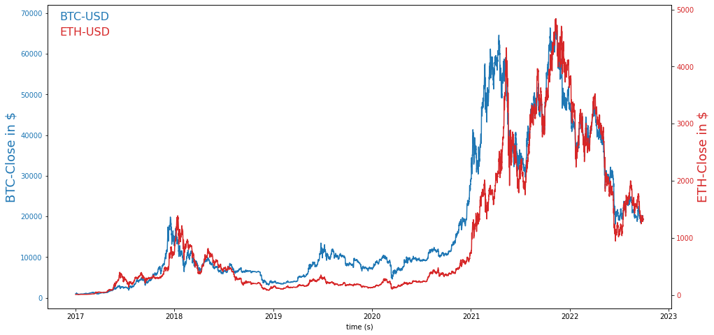
Next, we add two indicator values to our dataframe that we can later use to color the price chart.
Step #3 Calculate Indicator Values
The color overlay of the price chart is typically used to illustrate the relation between price and another variable, such as a statistical indicator. To demonstrate how this works, we will calculate two indicators and add them to our dataframe:
3.1 The Relative Strength Index
The Relative Strength Index (RSI) is a momentum indicator that signals the strength of a price trend. Its value range from 0 to 100%. A value above 70% signals that an asset is likely overbought. An overbought level is an area where the market is highly bullish and might decline. A value below 30% is typically a sign of an oversold condition. An oversold level is where the market is extremely bearish, and the price tends to reverse to the upper side.
3.2 The Pearson Correlation Coefficient
Pearson Correlation Coefficient: This indicator measures the correlation between two sets of stochastic variables. Its values range from -1 to 1. A value of 1 would imply a perfect stochastic correlation. For example, if the price of BTC changes by X percentage in a given period, we can expect ETH to experience the exact price change. A value of -1 would imply a perfect inverse correlation. For example, if the price of BTC were to increase by Y percent, we would also expect the ETH price to decrease by Y percent. A value of 0 implies no correlation. To learn more about correlation, check out my article about correlation in Python.
We embed the logic for calculating the two indicators in a different method called “add_indicators.”
def add_indicators(df):
    # Calculate the 30 day Pearson Correlation
    cor_period = 30 #this corresponds to a monthly correlation period
    columntobeadded = [0] * cor_period
    df = df.fillna(0)
    for i in range(len(df)-cor_period):
        btc = df['close-BTC-USD'][i:i+cor_period]
        eth = df['close-ETH-USD'][i:i+cor_period]
        corr, _ = pearsonr(btc, eth)
        columntobeadded.append(corr)
    # insert the colours into our original dataframe
    df.insert(2, "P_Correlation", columntobeadded, True)

    # Calculate the RSI
    # Moving Averages on high, lows, and std - different periods
    df['MA200_low'] = df['low-BTC-USD'].rolling(window=200).min()
    df['MA14_low'] = df['low-BTC-USD'].rolling(window=14).min()
    df['MA200_high'] = df['high-BTC-USD'].rolling(window=200).max()
    df['MA14_high'] = df['high-BTC-USD'].rolling(window=14).max()

    # Relative Strength Index (RSI)
    df['K-ratio'] = 100*((df['close-BTC-USD'] - df['MA14_low']) / (df['MA14_high'] - df['MA14_low']) )
    df['RSI'] = df['K-ratio'].rolling(window=3).mean()

    # Replace nas
    #nareplace = df.at[df.index.max(), 'close-BTC-USD']
    df.fillna(0, inplace=True)
    return df

dfcr = add_indicators(df)
At this point, we have added the RSI and the Correlation Coefficient to our dataframe. Let’s quickly visualize the two indicators in a line chart.
# Visualize measures
fig, ax1 = plt.subplots(figsize=(22, 4), sharex=False)
plt.ylabel('ETH-BTC Price Correlation', color=color)  # we already handled the x-label with ax1
x = y = dfcr.index
ax1.plot(x, dfcr['P_Correlation'], color='black')
ax2 = ax1.twinx()
ax2.plot(x, dfcr['RSI'], color='blue')
plt.tick_params(axis='y', labelcolor=color)

plt.show()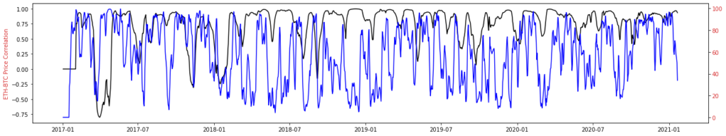
You may have noticed that the indicators remain at 0 at the time series beginning. However, this is perfectly fine. Since both indicators are calculated retrospectively, no values are available initially.
Step #4 Converting Indicator Values to Color Codes
Before creating the price charts, we have to color code the indicator values. We normalize the values and then assign a color to each indicator value using a color scale. We attach the colors to our existing dataframe to quickly access them when creating the plots.
# function that converts a given set of indicator values to colors
def get_colors(ind, colormap):
    colorlist = []
    norm = col.Normalize(vmin=ind.min(), vmax=ind.max())
    for i in ind:
        colorlist.append(list(colormap(norm(i))))
    return colorlist

# convert the RSI
y = np.array(dfcr['RSI'])
colormap = plt.get_cmap('plasma')
dfcr['rsi_colors'] = get_colors(y, colormap)

# convert the Pearson Correlation
y = np.array(dfcr['P_Correlation'])
colormap = plt.get_cmap('plasma')
dfcr['cor_colors'] = get_colors(y, colormap)
In our dataframe, two additional columns contain the color values for the two indicators. Now that we have all the data in our dataframe, the next step is creating the price charts.
Step #5 Creating Color-Coded Price Charts
Next, we use the color values to create two different color-coded price charts.
5.1 Bitcoin Price Chart Colored by RSI
We color the chart with the strength of the correlation between Bitcoin and Ethereum. Light-colored fields signal phases of a strong correlation. Price points colored in dark blue indicate phases where the correlation between the price movements of the two cryptocurrencies was negative.
# Create a Price Chart
pd.plotting.register_matplotlib_converters()
fig, ax1 = plt.subplots(figsize=(18, 10), sharex=False)
x = dfcr.index
y = dfcr['close-BTC-USD']
z = dfcr['rsi_colors']

# draw points
for i in range(len(dfcr)):
    ax1.plot(x[i], np.array(y[i]), 'o',  color=z[i], alpha = 0.5, markersize=5)
ax1.set_ylabel('BTC-Close in $')
ax1.tick_params(axis='y', labelcolor='black')
ax1.set_xlabel('Date')
ax1.text(0.02, 0.95, 'BTC-USD - Colored by RSI',  transform=ax1.transAxes, fontsize=16)

# plot the color bar
pos_neg_clipped = ax2.imshow(list(z), cmap='plasma', vmin=0, vmax=100, interpolation='none')
cb = plt.colorbar(pos_neg_clipped)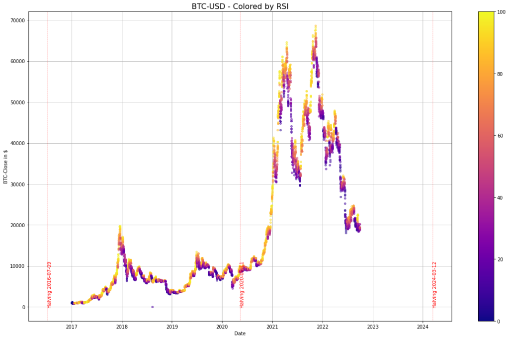
From the color overlay in the chart, we can tell that the RSI is low mainly (dark blue) when the Bitcoin price has seen a substantial decline and high (yellow) when the price has risen.
5.2 Bitcoin Price Chart colored by BTC-ETH Correlation
In this section, we will create another price chart for Bitcoin. This time we color code the price trend with the RSI. High RSI values are yellow, and low values are dark blue. Running the code below will create the color-coded bitcoin chart.
# create a price chart
pd.plotting.register_matplotlib_converters()
fig, ax1 = plt.subplots(figsize=(18, 10), sharex=False)
x = dfcr.index # datetime index
y = dfcr['close-BTC-USD'] # the price variable
z = dfcr['cor_colors'] # the color coded indicator values

# draw points
for i in range(len(dfcr)):
    ax1.plot(x[i], np.array(y[i]), 'o',  color=z[i], alpha = 0.5, markersize=5)
ax1.set_ylabel('BTC-Close in $')
ax1.tick_params(axis='y', labelcolor='black')
ax1.set_xlabel('Date')
ax1.text(0.02, 0.95, 'BTC-USD - Colored by 50-day ETH-BTC Correlation',  transform=ax1.transAxes, fontsize=16)

# plot the color bar
pos_neg_clipped = ax2.imshow(list(z), cmap='Spectral', vmin=-1, vmax=1, interpolation='none')
cb = plt.colorbar(pos_neg_clipped)
The chart shows that the correlation between Bitcoin and Ethereum (yellow color) was strong when the price of bitcoin rose. So when Bitcoin is in a bull market, Ethereum tends to follow a similar price logic. In contrast, the correlation was weak when the Bitcoin price declined (dark blue).
Summary
In this article, we demonstrated how to use Python and Seaborn to create a price chart that incorporates color as a third dimension. We used the Bitcoin price as an example and created two color-coded charts: one that highlights the RSI, and another that highlights the Pearson Correlation between Bitcoin and Ethereum.
By using color as an overlay, it is possible to highlight many interesting relationships in time-series data. A well-known example from the cryptocurrency world is the Bitcoin Rainbow Chart. This technique can be used to bring attention to various trends and patterns in the data.
I hope this article has helped to bring you closer to charts in Python. I am always interested to receive feedback from my audience. So, let me know if you liked this content, and if you have any questions, please post them in the comments.
Sources and Further Reading
The links above to Amazon are affiliate links. By buying through these links, you support the Relataly.com blog and help to cover the hosting costs. Using the links does not affect the price.
And if you are interested in stock-market prediction, check out the following articles: