

The spreading of COVID-19 has led to an increased interest in displaying region and country-specific information on geographic heat maps. Geographic heat maps use color shadings to visualize data that includes a spatial component and refers, for example, to countries, cities, towns, mountains, etc. The color shades are defined in a color palette and determined by numerical values on a scale. In this way, geographic heat maps give the viewer a quick overview of what is happening in different regions. This tutorial shows how to create geographic heat maps in Python using the GeoPandas library. We will work with COVID-19 data and visualize it using various color-coded maps.
The rest of this article proceeds as follows: We begin by going through the steps to visualize COVID-19 data on a geographic heat map. We will be using the GeoPandas library to plot the maps. Geopandas is an open-source project for working with geospatial data in Python. Our heat map will use color shades to visualize growth rates and total cases of COVID-19 in different countries. In addition, we will zoom in on specific map regions.
Also: Predictive Policing: Preventing Crime in San Francisco using XGBoost
What are Geographic Heat Maps?
Geographic heat maps are visual representations of data that use color or other visual encodings to show the density or intensity of data points in a geographic region. They are commonly used to represent data that is associated with a geographic location, such as population data, economic data, or weather data.
Geographic heat maps are typically created by overlaying a grid or mesh on a map and then assigning a color or other visual encoding to each grid cell based on the density or intensity of data points in that cell. The resulting heat map shows the distribution or pattern of data points across the geographic region and can provide valuable insights and information about the data.
Also: Color-Coded Cryptocurrency Price Charts in Python
What are Geographic Heat Maps used for?
Geographic heat maps are used for a variety of purposes, such as:
- Visualizing data: geographic heat maps can provide a clear and intuitive way to visualize data that is associated with a geographic location, allowing analysts and users to quickly and easily understand the data and identify patterns, trends, and relationships.
- Identifying spatial patterns: geographic heat maps can help to identify spatial patterns or trends in the data, such as clusters, outliers, or trends over time. This can provide valuable insights and information about the data and can help to inform decision-making and analysis.
- Analyzing and comparing data: geographic heat maps can be used to compare and contrast different datasets or to analyze the relationship between different variables or data sources. This can help to identify correlations, trends, or patterns that may not be immediately apparent from the raw data.
What are the Potential Pitfalls of Using Geographic Heat Maps?
While geographic heat maps are useful for all kinds of purposes, there are a few potential limitations and pitfalls to consider when using heat maps:
- Choosing an appropriate color scale: It’s essential to choose a color scale that accurately reflects the data being represented and is easy for viewers to interpret. If the color scale is not well-suited to the data, it can be difficult for viewers to understand the patterns being shown accurately.
- Overloading the map with too much data: It’s possible to add too much data to a heat map, which can make it difficult to interpret and potentially obscure important patterns. It’s important to balance the need for detail with the need for clarity when creating a heat map.
- Visual distortion: When working with large or irregularly shaped regions, it can be challenging to depict the data using a heat map accurately. This can lead to visual distortion, where the map does not accurately reflect the actual distribution of the data.
- Misinterpretation of the data: Heat maps are a visual representation of data, which can be subject to misinterpretation. It’s important to carefully consider how the data is represented and provide clear context and explanations for the presented patterns.
Let’s keep these potential pitfalls in mind during the following tutorial.
What is GeoPandas?
GeoPandas is a Python package that provides tools for working with geospatial data. It extends the popular pandas package, which provides data manipulation and analysis tools, to include support for geographic data. GeoPandas allows users to manipulate and analyze geospatial data in a familiar pandas DataFrame structure and includes functions for reading and writing spatial data in various formats, as well as tools for visualizing and mapping data.
GeoPandas is built on top of other popular packages, such as Shapely and Fiona, and is a popular choice for working with geospatial data in Python.
With GeoPandas, users can:
- Read and write spatial data in various formats, such as Shapefile, GeoJSON, and GeoPackage.
- Perform geometric operations on spatial data, such as buffering, intersection, and union.
- Create maps and visualize spatial data using matplotlib, a popular Python plotting library.
- Analyze and manipulate spatial data in a pandas DataFrame structure, allowing users to use the powerful data manipulation and analysis tools provided by pandas.
Creating Geographic Heat Maps with Python and GeoPandas
In this tutorial, we will learn how to create geographic heat maps using Python and the GeoPandas package. Geographic heat maps are visualizations that show the intensity of data at different locations on a map. They are commonly used to represent the distribution of a variable across a geographic area, and can be useful for identifying patterns, trends, and anomalies in the data. In this tutorial, we will learn how to create geographic heat maps using Python and the GeoPandas package. In the following, we will walk through the steps of loading, manipulating, and visualizing spatial data with GeoPandas, and demonstrate how to create geographic heat maps for covid-19.
The code is available on the GitHub repository.
Prerequisites
Before starting the coding part, make sure that you have set up your Python 3 environment and required packages. If you don’t have an environment set up yet, you can follow the steps in this tutorial to set up the Anaconda environment.
Also, make sure you install all required packages. We will be working with the following standard packages:
You can install packages using console commands:
pip install <package name>
conda install <package name> (if you are using the anaconda packet manager)
We will create geographic heat maps with the GeoPandas Python library. You can install GeoPandas via the console by using the following command:
- conda install –channel conda-forge geopandas
- pip install geopandas
Update (2020-09-23): With the release of Python 3.8, there is a new install procedure:
conda create -n geo_env
conda activate geo_env
conda config --env --add channels conda-forge
conda config --env --set channel_priority strict
conda install python=3 geopandas
Download the Geographic Map Data From Naturalearthdata
First, we will get the map with the geospatial data. Rendering maps with GeoPandas requires a shapefile. A shapefile is a DataFrame with some graphical data attached. For instance, some shapefiles show cities, countries, continents, or maps of the entire world. So in our case, the shapefile is a list of countries, whereby each country has its graphical representation in polygons. The example presented in this tutorial will use a world map.
Various sources on the web provide shapefiles for different geographical regions and in varying detail. For example, naturalearthdata.com provides a map of the world. To download the map, go to the natualearthdata webpage, and with a click on the green button, you can download version 4.1.0.
Once the download is complete, unpack the files into the folder of your Python notebook or a subfolder in the folder of your Python notebook (e.g., data/shapefiles/worldmap/).
Step #1 Loading the COVID-19 Data
Next, we retrieve the COVID-19 data for all countries via the statworx API. If you want to learn more about using REST APIs, check out this tutorial on accessing data sources via REST APIs.
Also: Accessing Remote Data Sources via REST APIs in Python
# Setting up Packages
import json
import country_converter as coco
from datetime import datetime, timedelta
import requests
import pandas as pd
import geopandas as gpd
import matplotlib.pyplot as plt
# Getting the data
PAYLOAD = {'code': 'ALL'}
URL = 'https://api.statworx.com/covid'
RESPONSE = requests.post(url=URL, data=json.dumps(PAYLOAD))
# Convert the response to a data frame
covid_df = pd.DataFrame.from_dict(json.loads(RESPONSE.text))
covid_df.head(3)
date day month year cases deaths country code population continent cases_cum deaths_cum 0 2019-12-31 31 12 2019 0 0 Afghanistan AF 38041757.0 Asia 0 0 1 2020-01-01 1 1 2020 0 0 Afghanistan AF 38041757.0 Asia 0 0 2 2020-01-02 2 1 2020 0 0 Afghanistan AF 38041757.0 Asia 0 0
We continue by preparing the COVID-19 data for visualizing them on a heat map.
Step #2 Specifying a Shapefile
Next, we use the Geopandas library to read in a shapefile at “data/shapefiles/worldmap/ne_10m_admin_0_countries.shp”. We then select the columns “ADMIN,” “ADM0_A3”, and “geometry” from the shapefile and store them in a GeoDataFrame called “geo_df.” Finally, we display the first three rows of the GeoDataFrame.
# Setting the path to the shapefile
SHAPEFILE = 'data/shapefiles/worldmap/ne_10m_admin_0_countries.shp'
# Read shapefile using Geopandas
geo_df = gpd.read_file(SHAPEFILE)[['ADMIN', 'ADM0_A3', 'geometry']]
# Rename columns.
geo_df.columns = ['country', 'country_code', 'geometry']
geo_df.head(3)
	country		country_code	geometry
0	Indonesia	IDN				MULTIPOLYGON (((117.70361 4.16341, 117.70361 4...
1	Malaysia	MYS				MULTIPOLYGON (((117.70361 4.16341, 117.69711 4...
2	Chile		CHL				MULTIPOLYGON (((-69.51009 -17.50659, -69.50611
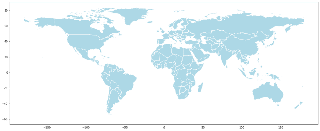
We have created a dataframe with three columns, as you can see above. The column geometry contains the graphical representation of countries. Now that we have prepared the data, we can plot our first geographic map. We create the map by using the GeoPandas plot function.
# Drop row for 'Antarctica'. It takes a lot of space in the map and is not of much use
geo_df = geo_df.drop(geo_df.loc[geo_df['country'] == 'Antarctica'].index)
# Print the map
geo_df.plot(figsize=(20, 20), edgecolor='white', linewidth=1, color='lightblue')
If you get an error: “ImportError: The Descartes package is required for plotting polygons in GeoPandas.” you first have to install the Descartes package. You can do this by typing in your console: conda install descartes
Step #3 Bringing It All Together
Next, we need to ensure that our data matches the country codes. The dataframe with the geospatial data of the world map contains country codes that adhere to iso3. However, our COVID-19 data uses iso2_codes. Luckily there is a country_converter available that does this job for us:
# Next, we need to ensure that our data matches with the country codes.
iso3_codes = geo_df['country'].to_list()
# Convert to iso3_codes
iso2_codes_list = coco.convert(names=iso3_codes, to='ISO2', not_found='NULL')
# Add the list with iso2 codes to the dataframe
geo_df['iso2_code'] = iso2_codes_list
# There are some countries for which the converter could not find a country code.
# We will drop these countries.
geo_df = geo_df.drop(geo_df.loc[geo_df['iso2_code'] == 'NULL'].index)
We have a list with all nations’ names (country) and codes (country_code). An additional column includes the geographical representation of each country.
Step #4 Preprocessing
Our COVID-19 data so far contains historical Covid-19 cases. We want to drop these historical cases and only get the data from the last day. Then we merge the data frames.
Before we plot the heat map, we have to specify a variable that determines the color of the countries on the map. Our goal is to color the countries depending on the growth rate of COVID-19 cases per day. The formula for the growth rate is ‘new cases’ / total present cases.
# We want to drop the history and only get the data from the last day
d = datetime.today()-timedelta(days=1)
date_yesterday = d.strftime("%Y-%m-%d")
# Preparing the data
covid_df = covid_df[covid_df['date'] == date_yesterday]
# Merge the two dataframes
merged_df = pd.merge(left=geo_df, right=covid_df, how='left', left_on='iso2_code', right_on='code')
# Delete some columns that we won't use
df = merged_df.drop(['day', 'month', 'year', 'country_y', 'code'], axis=1)
#Create the indicator values
df['case_growth_rate'] = round(df['cases']/df['cases_cum'], 2)
df['case_growth_rate'].fillna(0, inplace=True)
df.head(3)
country_x country_code geometry iso2_code date cases deaths population continent cases_cum deaths_cum case_growth_rate 0 Indonesia IDN MULTIPOLYGON (((117.70361 4.16341, 117.70361 4... ID 2020-06-28 1385.0 37.0 270625567.0 Asia 52812.0 2720.0 0.03 1 Malaysia MYS MULTIPOLYGON (((117.70361 4.16341, 117.69711 4... MY 2020-06-28 10.0 0.0 31949789.0 Asia 8616.0 121.0 0.00 2 Chile CHL MULTIPOLYGON (((-69.51009 -17.50659, -69.50611... CL 2020-06-28 4406.0 279.0 18952035.0 America 267766.0 5347.0 0.02
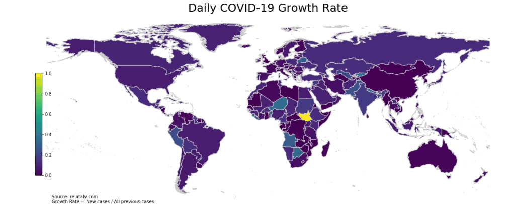
Step #5 Creating a Geographic Heat Map
In the previous step, we set up the data for our map. Next, we create the geographical heat map for the world.
We set the path to the shapefile and use Geopandas to read it. We then rename these columns. Next, we set the range for the choropleth and create a figure and axes for Matplotlib. We remove the axis and plot the choropleth using the data from the ‘df’ dataframe and the ‘case_growth_rate’ column, setting the edgecolor, linewidth, and cmap. We also add a title to the map and an annotation for the data source. Additionally, we create a colorbar as a legend, using the ScalarMappable function, and add it to the figure with a specified position.
# Print the map
# Set the range for the choropleth
title = 'Daily COVID-19 Growth Rates'
col = 'case_growth_rate'
source = 'Source: relataly.com \nGrowth Rate = New cases / All previous cases'
vmin = df[col].min()
vmax = df[col].max()
cmap = 'viridis'
# Create figure and axes for Matplotlib
fig, ax = plt.subplots(1, figsize=(20, 8))
# Remove the axis
ax.axis('off')
df.plot(column=col, ax=ax, edgecolor='0.8', linewidth=1, cmap=cmap)
# Add a title
ax.set_title(title, fontdict={'fontsize': '25', 'fontweight': '3'})
# Create an annotation for the data source
ax.annotate(source, xy=(0.1, .08), xycoords='figure fraction', horizontalalignment='left',
            verticalalignment='bottom', fontsize=10)

# Create colorbar as a legend
sm = plt.cm.ScalarMappable(norm=plt.Normalize(vmin=vmin, vmax=vmax), cmap=cmap)
# Empty array for the data range
sm._A = []
# Add the colorbar to the figure
cbaxes = fig.add_axes([0.15, 0.25, 0.01, 0.4])
cbar = fig.colorbar(sm, cax=cbaxes)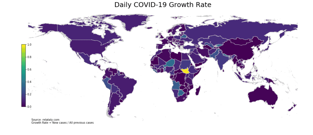
As shown in the map above, countries in Central Asia and Africa currently report the highest COVID-19 growth rates.
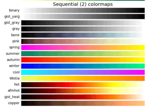
There are different color palettes. You can use them by altering the cmap variable. Below is a sample of ready-to-use color scales. You can find more color scales on the matblotlib page.
Step #6 Zooming in on Specific Regions
We have observed that many African countries are currently reporting rising case numbers, so we create a new dataframe based on a filter for African countries using the list of country codes.
In the following, we create a geographic map specifically for Africa. We can zoom in on a continent or a country by filtering our dataframe. The code below will filter the spatial-geo data to African countries and plot the heat map. We plot the map for Africa using this new dataframe, setting the title of the map to ‘COVID-19 Growth Rate per Day in Africa’ and adding a source annotation to the bottom left corner of the map.
# The map shows that many african countries are currently reporting increasing case numbers
# Next we create a new df based on a filter for african countries
africa_country_list = ['ZM', 'BF', 'TZ', 'EG', 'UG', 'TN', 'TG', 'SZ', 'SD',
                       'EH', 'SS', 'ZW', 'ZA', 'SO', 'SL', 'SC', 'SN', 'ST',
                       'SH', 'RW', 'RE', 'GW', 'NG', 'NE', 'NA', 'MZ', 'MA',
                       'MU', 'MR', 'ML', 'MW', 'MG', 'LY', 'LR', 'LS', 'KE',
                       'CI', 'GN', 'GH', 'GM', 'GA', 'DJ', 'ER', 'ET', 'GQ',
                       'BJ', 'CD', 'CG', 'YT', 'KM', 'TD', 'CF', 'CV', 'CM',
                       'BI', 'BW', 'AO', 'DZ']
africa_map_df = df[df['iso2_code'].isin(africa_country_list)]
# Plot the map for Africa
title = 'COVID-19 Growth Rate per Day in Africa'
col = 'case_growth_rate'
source = 'Source: relataly.com \nGrowth Rate = New cases / All previous cases'
vmin = df[col].min()
vmax = df[col].max()
fig, ax = plt.subplots(1, figsize=(20, 9))
ax.axis('off')
africa_map_df.plot(column=col, ax=ax, edgecolor='0.8', linewidth=1, cmap=cmap)
ax.set_title(title, fontdict={'fontsize': '25', 'fontweight': '3'})
ax.annotate(source, xy=(0.24, .08), xycoords='figure fraction',
            horizontalalignment='left',
            verticalalignment='bottom', fontsize=10)
sm = plt.cm.ScalarMappable(norm=plt.Normalize(vmin=vmin, vmax=vmax), cmap=cmap)
cbaxes = fig.add_axes([0.35, 0.25, 0.01, 0.5])
{"type":"block","srcIndex":53,"srcClientId":"2ddd9666-6def-46e0-803e-4bf7b0366a27","srcRootClientId":""}cbar = fig.colorbar(sm, cax=cbaxes)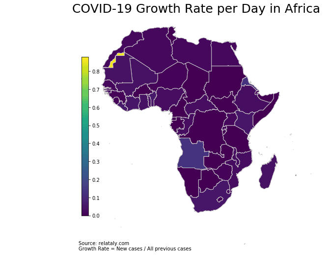
In case you encounter an error with the mapclassify-package, you can try the following command to reinstall it: conda install -c conda-forge mapclassify
Voilá, now we only see the African continent. The map shows that the countries in Africa that currently report the highest total case numbers are South Africa, Algeria, Morocco, Kamerun, and Egypt.
Let’s take a look at the total cases per country in Africa:
# Insert cases per population
# Alternative: africa_map_df2['cases_population'] = round(africa_map_df['cases_cum'] / africa_map_df['population'] * 100)
africa_map_df2 = africa_map_df.copy()
# Remove NAs
africa_map_df2.loc[: , 'cases_cum'].fillna(0, inplace=True)
# Show the data
africa_map_df2.head()
# Plot the map
title = 'Total COVID-19 Cases on the African Continent'
col = 'cases_cum'
source = 'Source: relataly.com '
vmin = africa_map_df2[col].min()
vmax = africa_map_df2[col].max()
fig, ax = plt.subplots(1, figsize=(20, 9))
ax.axis('off')
africa_map_df2.plot(column=col, ax=ax, edgecolor='1', linewidth=1, cmap=cmap)
ax.set_title(title, fontdict={'fontsize': '25', 'fontweight' : '3'})
ax.annotate(
    source, xy=(0.24, .08), xycoords='figure fraction', horizontalalignment='left',
    verticalalignment='bottom', fontsize=10)
sm = plt.cm.ScalarMappable(norm=plt.Normalize(vmin=vmin, vmax=vmax), cmap=cmap)
cbaxes = fig.add_axes([0.35, 0.25, 0.01, 0.5])
cbar = fig.colorbar(sm, cax=cbaxes)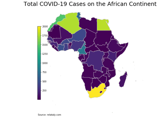
The highest growth rate was reported by South Sudan, followed by Botswana and Niger.
Step #7 Saving a Geo-Heat Maps to PNG
If you want to save the map, you can do this with the following command.
# Safe the map to a png
fig.savefig('map_export.png', dpi=300)
Summary
This article showed how to create geographic heat maps using the Geopandas library in Python. It showed how to read in a shapefile and create a choropleth map using the data from a dataframe. Additionally, the article explained how to filter the data to display maps of specific regions, in this case Africa. We showed how to prepare spatial data and color-code the maps using COVID-19 data. In addition, we filtered the DataFrame to create maps for specific regions, zoom in on specific areas, and alter the color style using different color maps.
Geographic heat maps can provide valuable insights into the distribution of data and help to identify patterns and trends. The technique of creating heat maps with Geopandas is a powerful tool for data visualization and can be applied to a wide range of geographical data.
I hope this article was helpful. If you have any questions or remarks, please write them in the comments.
Looking for more exciting map visualizations? Consider this relataly tutorial on predicting and visualizing crimes on a map of San Francisco.
Sources and Further Reading
https://geopandas.org/en/stable/getting_started.html

Hello, a little mistake in line 15 and 16 of step#6
it should be
Very good article, thanks for help!
I wish the map the tutorial created was similar to the heatmap at the top of the article.
A tutorial on partially filling polygons would be nice!
This is so helpfuul for my DA assignment thank you!!