Predictive maintenance is a game-changer for the modern industry. Still, it is based on a simple idea: By using machine learning algorithms, businesses can predict equipment failures before they happen. This approach can help businesses improve their operations by reducing the need for reactive, unplanned maintenance and by enabling them to schedule maintenance activities during planned downtime. In this article, we’ll explore the use of machine learning algorithms to predict machine failures using the robust XGBoost algorithm in Python. By the end of this tutorial, you’ll have the knowledge and skills to start implementing predictive maintenance in your organization. So, let’s get started!
We begin by discussing the concept of predictive maintenance and show different ways to implement it. Then we will turn to the coding part in python and implement the prediction model based on machine sensor data. We train a classification model that predicts different types of machine failure using XGBoost.

What is Predictive Maintenance?
Predictive maintenance is a data-driven approach that uses predictive modeling to assess the state of equipment and determine the optimal timing for maintenance activities. This technique is particularly beneficial in industries that heavily rely on equipment for their operations, such as manufacturing, transportation, energy, and healthcare. Depending on the requirements and challenges of an organization, predictive maintenance may contribute to one or several of the following goals:
- Improve equipment reliability: By proactively identifying and addressing potential problems with equipment, predictive maintenance can help improve the reliability of the equipment, reducing the risk of unexpected downtime or failure.
- Increase efficiency: Predictive maintenance can help improve the efficiency of equipment by identifying and fixing problems before they cause equipment failure or downtime. This can help reduce maintenance costs and increase productivity.
- Improve safety: Predictive maintenance can help improve safety by identifying and addressing potential problems with equipment before they occur. This can help prevent accidents and injuries caused by equipment failure.
- Reduce maintenance costs: By proactively identifying and fixing potential problems with equipment, predictive maintenance can help reduce the overall cost of maintenance by minimizing the need for unscheduled downtime.
- Improve asset management: Predictive maintenance can help improve asset management by providing data and insights into the condition and performance of equipment. This can help organizations decide when to replace or upgrade equipment.
Next, we look at the different ways organizations can implement predictive maintenance.

Approaches to Predictive Maintenance
There are several approaches to implementing a predictive maintenance solution, depending on the type of equipment being monitored and the resources available. These approaches include:
- Condition-based monitoring: This involves continuously monitoring the condition of the equipment using sensors. When certain thresholds or conditions are met, an alert is triggered, or corrective measures are launched. The goal is to reduce the risk of failure. For example, if the temperature of a motor exceeds a certain level, this may indicate that the motor is about to fail.
- Predictive modeling: This approach involves using machine learning algorithms to analyze historical lifetime data about the equipment to identify patterns that may indicate an impending failure. This can be done using data from sensors, as well as operational data and maintenance records. When historical or failure data is not available, a degradation model can be created to estimate failure times based on a threshold value. This approach is often used when there is limited data available.
- Prognostic algorithms: By using data from sensors and other sources, prognostic algorithms can predict the remaining useful life of a piece of equipment. This information can help organizations determine the likelihood of a breakdown and plan for replacements or maintenance activities. By understanding the equipment better, organizations can potentially extend maintenance cycles, which can reduce costs for replacements and maintenance.
It is important to choose an approach that is appropriate for the specific equipment and maintenance challenges faced by the organization.
Data Requirements
When implementing predictive maintenance, it is important to consider that each approach comes with its own set of data requirements. Types of data include the following:
- Current condition data includes information about the state of the equipment, such as its temperature, pressure, vibration, and other physical parameters.
- Operating data includes information about how the equipment is being used, such as its load, speed, and other operating parameters.
- Maintenance history data includes information about past maintenance activities that have been performed on the equipment.
- Failure history data includes information about past equipment failures, such as the date of the failure, the cause of the failure, and the impact on operations.
Collecting these data requires investing in sensors and other data collection infrastructure and ensuring that data collection is accurate and storage is proper. By combining various data types, organizations can create a comprehensive view of equipment condition and performance and use it to predict maintenance requirements.
The specific types of data needed will depend on the implementation approach. Organizations must ensure they have access to the necessary data to implement the selected approach effectively. Some specific data requirements for each approach include the following:
| Approach | Data Requirements |
|---|---|
| Condition-based monitoring | Sensor data from the equipment being monitored. |
| Predictive modeling | A combination of sensor data, operational data, and maintenance records. |
| Prognostic algorithms | Sensor data, as well as data about past failures and maintenance events. |

Predicting Failures in Milling Machines using XGBoost in Python
Now that we have a basic understanding of predictive maintenance, it’s time to get hands-on with Python. We will use sensor data and machine learning to predict failures in milling machines. But why do these machines break down in the first place? Milling machines have many moving parts that can suffer from wear and tear over time, leading to failures. Additionally, improper maintenance can cause issues with machine operation and lead to costly damage. Efficient maintenance can be challenging due to the varying loads that milling machines are subjected to. However, by implementing a predictive maintenance solution with Python, we can proactively identify and address issues to prevent costly downtime and ensure the smooth operation of our milling machines. Our goal is to predict one of five failure types, which corresponds to a predictive modeling approach. Let’s get started on building our predictive maintenance solution.
The code is available on the GitHub repository.

Prerequisites
Before starting the coding part, make sure that you have set up your Python 3 environment and required packages.
Python Environment
Before diving into the FairLearn Python tutorial, it is important to take the necessary steps to ensure that your Python environment is properly set up and that you have all the required packages installed. This will ensure a seamless learning experience and prevent any potential roadblocks or issues that may arise due to an improperly configured environment.
If you don’t have an environment, follow this tutorial to set up the Anaconda environment.
Python Packages
Make sure you install all required packages. In this tutorial, we will be working with the following packages:
- Pandas
- NumPy
- Matplotlib
- Seaborn
- Plotly
In addition, we will be using the machine learning library Scikit-learn and the XGBoost library, which is a popular library for training gradient-boosting models.
You can install packages using console commands:
pip install <package name>
conda install <package name> (if you are using the anaconda packet manager)
About the Sensor Dataset
In this tutorial, we will work with a synthetic sensor dataset from the UCL ML archives that simulates the typical life cycle of a milling machine. The dataset contains the following fields:
The dataset consists of 10 000 data points stored as rows with 14 features in columns:
- UID: unique identifier ranging from 1 to 10000
- productID: consisting of a letter L, M, or H for low (50% of all products), medium (30%), and high (20%) as product quality variants and a variant-specific serial number
- air temperature [K]
- process temperature [K]
- rotational speed [rpm]
- torque [Nm]
- tool wear [min]
- machine failure. A label that indicates whether the machine has failed or not
- Failure type (prediction label). The label contains five failure types: tool wear failure (TWF), heat dissipation failure (HDF), power failure (PWF), overstrain failure (OSF), random failures (RNF)
Source: UCL ML Repository
You can download the dataset from Kaggle.com. Unzip the file predictive_maintenance.csv and save it under the following file path: “/data/iot/classification/”
Step #1 Load the Data
We begin by importing the required libraries. This also includes the XGBoost library, which is a popular library for training gradient-boosting models. In addition, we will load the dataset using the pandas library. Then we define our target variable as Failure Type. The dataset contains a second target column, which only contains the binary information of machine failures. We will drop this column, as our goal is to predict the specific type of failure. Then we print the first three rows of the loaded dataset.
# A tutorial for this file is available at www.relataly.com
# Tested with Python 3.9.13, Matplotlib 3.6.2, Scikit-learn 1.2, Seaborn 0.12.1, numpy 1.21.5, xgboost 1.7.2

import pandas as pd
import matplotlib.pyplot as plt
import numpy as np
import seaborn as sns
import plotly.express as px
sns.set_style('white', { 'axes.spines.right': False, 'axes.spines.top': False})
from sklearn.metrics import classification_report, confusion_matrix, precision_recall_fscore_support as score, roc_curve
from sklearn.model_selection import cross_val_score, train_test_split, cross_validate
from sklearn.utils import compute_sample_weight
from xgboost import XGBClassifier

# load the train data
path = '/data/iot/classification/'
df = pd.read_csv(path + "predictive_maintenance.csv")

# define the target
target_name='Failure Type'

# drop a redundant columns
df.drop(columns=['Target'], inplace=True)

# print a summary of the train data
print(df.shape[0])
df.head(3)
UDI Product ID Type Air temperature [K] Process temperature [K] Rotational speed [rpm] Torque [Nm] Tool wear [min] Failure Type 0 1 M14860 M 298.1 308.6 1551 42.8 0 No Failure 1 2 L47181 L 298.2 308.7 1408 46.3 3 No Failure 2 3 L47182 L 298.1 308.5 1498 49.4 5 No Failure
Step #2 Clean the Data
Next, we quickly check the data quality of our dataset. The following code block checks if there are any missing values in our dataset. If there are missing values, it creates a barplot showing the number of missing values for each column, along with the percentage of missing values. If there are no missing values, it prints a message saying “no missing values.”
The function then drops any columns with more than 5% missing values from the DataFrame. Finally, it prints the names of the remaining columns in the DataFrame. This function can be used to identify and handle missing values in a dataset before applying machine learning algorithms to it.
# check for missing values
def print_missing_values(df):
    null_df = pd.DataFrame(df.isna().sum(), columns=['null_values']).sort_values(['null_values'], ascending=False)
    fig = plt.subplots(figsize=(16, 6))
    ax = sns.barplot(data=null_df, x='null_values', y=null_df.index, color='royalblue')
    pct_values = [' {:g}'.format(elm) + ' ({:.1%})'.format(elm/len(df)) for elm in list(null_df['null_values'])]
    ax.set_title('Overview of missing values')
    ax.bar_label(container=ax.containers[0], labels=pct_values, size=12)

if df.isna().sum().sum() > 0:
    print_missing_values(df)
else:
    print('no missing values')

# drop all columns with more than 5% missing values
for col_name in df.columns:
    if df[col_name].isna().sum()/df.shape[0] > 0.05:
        df.drop(columns=[col_name], inplace=True)

df.columns
no missing values
Index(['UDI', 'Product ID', 'Type', 'Air temperature [K]',
'Process temperature [K]', 'Rotational speed [rpm]', 'Torque [Nm]',
'Tool wear [min]', 'Failure Type'],
dtype='object')Next, we will drop two unnecessary columns and rename the remaining ones to make them easier to work with. The original column names are quite long and contain special characters that could cause errors during the training process. Once the columns are renamed, we will print the updated DataFrame to verify the changes.
# drop id columns
df_base = df.drop(columns=['Product ID', 'UDI'])

# adjust column names
df_base.rename(columns={'Air temperature [K]': 'air_temperature',
                        'Process temperature [K]': 'process_temperature',
                        'Rotational speed [rpm]':'rotational_speed',
                        'Torque [Nm]': 'torque',
                        'Tool wear [min]': 'tool_wear'}, inplace=True)
df_base.head()
Type air_temperature process_temperature rotational_speed torque tool_wear Failure Type 0 M 298.1 308.6 1551 42.8 0 No Failure 1 L 298.2 308.7 1408 46.3 3 No Failure 2 L 298.1 308.5 1498 49.4 5 No Failure 3 L 298.2 308.6 1433 39.5 7 No Failure 4 L 298.2 308.7 1408 40.0 9 No Failure
Everything looks as expected: Our dataset contains six features and the target column with the five failure types.
Step #3 Explore the Data
Next, let’s explore the dataset.
Target Class Distribution
The following code uses the plotly express library to create a histogram showing the class distribution of the “Failure Type” column in a DataFrame called “df_base.” The histogram will have one bar for each unique value in the “Failure Type” column, and the height of each bar will represent the number of occurrences of that value in the column. This can be useful for understanding the imbalance in the distribution of classes in a classification problem.
# display class distribution of the target variable
px.histogram(df_base, y="Failure Type", color="Failure Type")

Our dataset is highly imbalanced, with the vast majority of cases having a “No Failure” label. If the dataset is highly imbalanced, with a disproportionate number of cases in one class compared to the others, it can impact the performance of machine learning models. This is because imbalanced datasets can lead to models that are biased towards the majority class, and may not perform well on the minority class. In order to improve model performance on imbalanced datasets, we will later adjust the model hyperparameters accordingly.
Feature Pairplots
Next, let’s construct pair plots to explore feature relations with the target variable. Pair plots, also known as scatter plots, are a type of plot that shows the relationship between two variables. In the context of a predictive maintenance dataset, pair plots can be useful for exploring the relationships between different features and the target variable (e.g., the likelihood of a machine failure). By creating pair plots and visualizing the relationships between different features and the target variable, you can gain insights into which features might be most useful for building a predictive model.
# pairplots on failure type
sns.pairplot(df_base, height=2.5, hue='Failure Type')
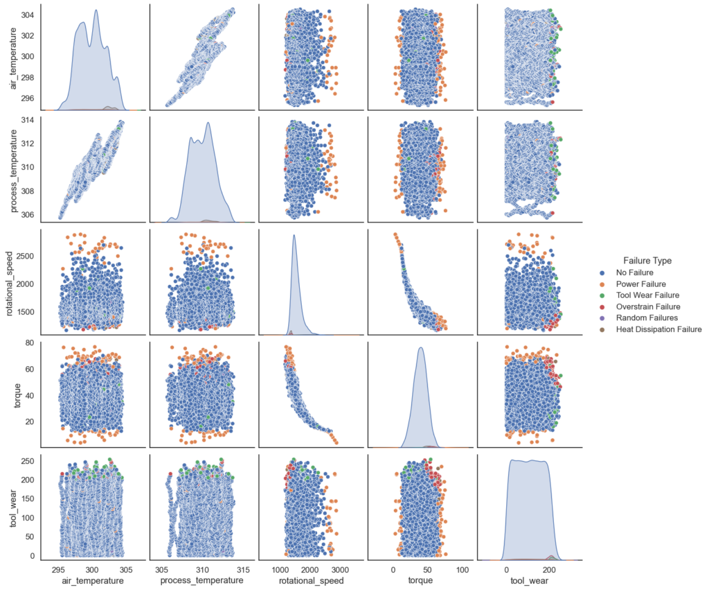
The pair plots reveal valuable patterns in our features that can inform the predictions of our model. For instance, we see that Power Failures tend to be correlated with torque values that are either close to the maximum or minimum. Such patterns should allow our predictive model to make solid predictions.
Feature Correlation
Next, we will look at feature correlation. The following code block creates a heatmap using the seaborn library that shows the correlation between all pairs of columns in a DataFrame called “df_base”. The heatmap is plotted using a color scale, with warmer colors indicating stronger correlations and cooler colors indicating weaker correlations. The correlation values are also displayed in the cells of the heatmap, with values ranging from -1 (perfect negative correlation) to 1 (perfect positive correlation). By creating a heatmap, you can quickly see which variables are positively or negatively correlated with each other, and to what degree. This can be helpful for identifying which features might be most useful for building a predictive model.
# correlation plot
plt.figure(figsize=(6,4))
sns.heatmap(df_base.corr(), cbar=True, fmt='.1f', vmax=0.8, annot=True, cmap='Blues')
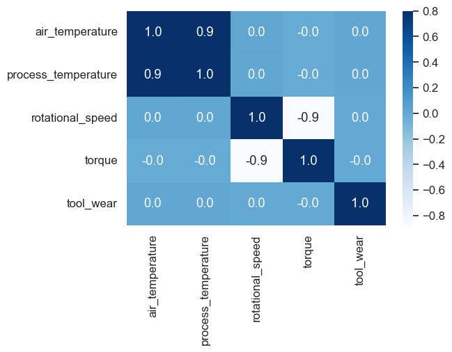
From the table, it looks like there is a strong positive correlation between “air_temperature” and “process_temperature” (0.87). This makes sense since a high process temperature will naturally also heat up the air around the machine. In addition, there is a strong negative correlation between “rotational_speed” and “torque” (-0.87). The other correlations are weaker and closer to 0, indicating weaker relationships.
Understanding the correlations between different variables in a dataset can be helpful for building predictive models, as it can give you an idea of which features might be most important for predicting a given target. It can also help you identify any redundant features that might not add much value to your model. Since our dataset only contains six features, we will keep all of them.
Feature Boxplots
Box plots are a useful visualization tool for understanding the distribution of values in a dataset. They show the minimum, first quartile, median, third quartile, and maximum values for each group, as well as any outliers. By creating box plots separated by a categorical variable, you can compare the distributions of values between different groups and see if there are any significant differences. This can be useful for identifying trends or patterns in the data that might be useful for building a predictive model.
If there are significant differences between the boxplots for different categories, it could be a good sign for building a predictive model. For example, if the boxplots for one category tend to have higher values for a particular feature than the boxplots for another category, it could indicate that the feature is related to the target variable and could be useful for making predictions.
# create histograms for feature columns separated by target column
def create_histogram(column_name):
    plt.figure(figsize=(16,6))
    return px.box(data_frame=df_base, y=column_name, color='Failure Type', points="all", width=1200)

create_histogram('air_temperature')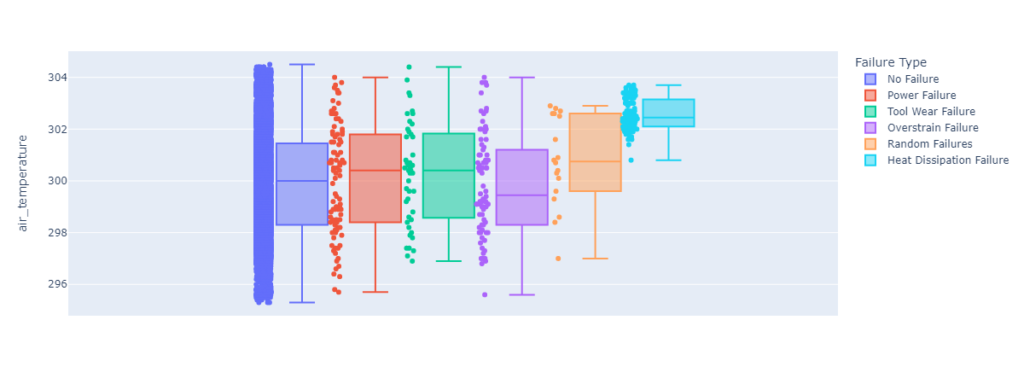
Feature boxplot for process_temperature.
create_histogram('process_temperature')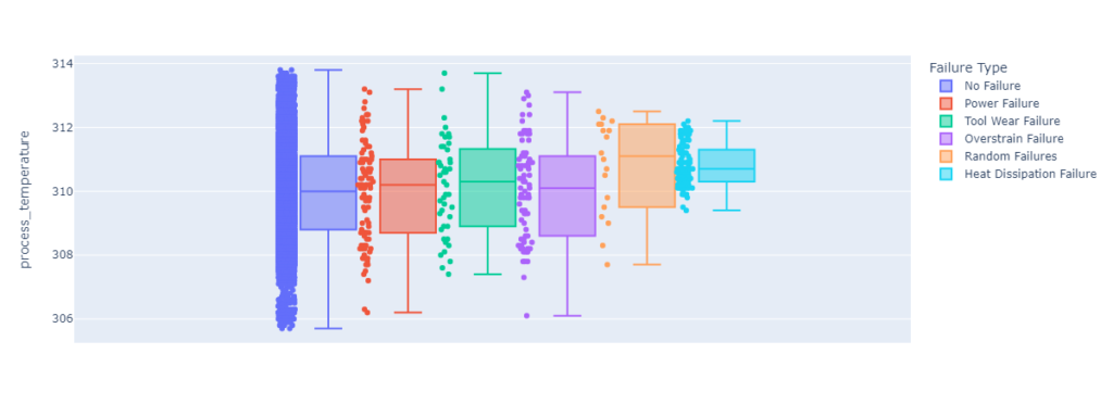
create_histogram('rotational_speed')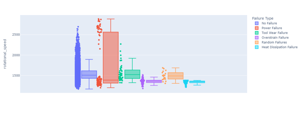
Feature boxplot for torque.
create_histogram('torque')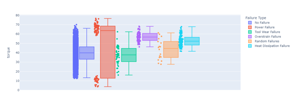
Feature boxplot for tool wear.
create_histogram('tool_wear')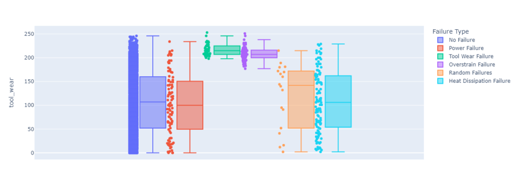
Now that we have a good understanding of our dataset, we can prepare the data for model training.
Step #4 Data Preparation
To prepare the data for model training, we will need to split our dataset and make additional modifications.
The following code block contains a reusable function called data_preparation. The purpose of this function is to prepare the data in a way that is suitable for building and evaluating machine learning models. It performs several preprocessing steps, such as encoding categorical variables and splitting the data into training and test sets.
def data_preparation(df_base, target_name):
    df = df_base.dropna()

    df['target_name_encoded'] = df[target_name].replace({'No Failure': 0, 'Power Failure': 1, 'Tool Wear Failure': 2, 'Overstrain Failure': 3, 'Random Failures': 4, 'Heat Dissipation Failure': 5})
    df['Type'].replace({'L': 0, 'M': 1, 'H': 2}, inplace=True)
    X = df.drop(columns=[target_name, 'target_name_encoded'])
    y = df['target_name_encoded'] #Prediction label

    # split the data into x_train and y_train data sets
    X_train, X_test, y_train, y_test = train_test_split(X, y, train_size=0.7, random_state=0)

    # print the shapes: the result is: (rows, training_sequence, features) (prediction value, )
    print('train: ', X_train.shape, y_train.shape)
    print('test: ', X_test.shape, y_test.shape)
    return X, y, X_train, X_test, y_train, y_test

# remove target from training data
X, y, X_train, X_test, y_train, y_test = data_preparation(df_base, target_name)
Step #5 Model Training
Now that we have prepared the dataset, we can train the XGBoost classification model. The basic idea behind XGBoost is to train a series of weak models, such as decision trees, and then combine their predictions using gradient boosting. During training, XGBoost uses an optimization algorithm to adjust the weight of each model in the ensemble in order to improve the overall prediction accuracy. XGBoost also includes a number of additional features and techniques that help to improve the performance of the model, such as regularization, feature selection, and handling missing values.
XGboost provides several configuration options that we can use to finetune performance and adjust the training process to our dataset. For a complete list of hyperparameters, please see the library documentation.
Remember that our class labels are imbalanced. Therefore, we will provide the model with sample weights. The following code creates a weight array for the training and test sets using the “compute_sample_weight” function from scikit-learn. We calculate the weight array based on the “balanced” mode. This means that the weights are calculated such that the class distribution in the sample is balanced. This can be useful when working with imbalanced datasets, as it helps to mitigate the effects of class imbalance on the model.
weight_train = compute_sample_weight('balanced', y_train)
weight_test = compute_sample_weight('balanced', y_test)

xgb_clf = XGBClassifier(booster='gbtree',
                        tree_method='gpu_hist',
                        sampling_method='gradient_based',
                        eval_metric='aucpr',
                        objective='multi:softmax',
                        num_class=6)
# fit the model to the data
xgb_clf.fit(X_train, y_train.ravel(), sample_weight=weight_train)
We can see that the blue box summarizes the configuration of our model and indicates that the training process has been successful. Now that we have the classifier, we can use it to make predictions on new data.
Step #6 Model Evaluation
Finally, we will evaluate the model’s performance. This will involve three steps:
- Model scoring
- Cross-validation
- Confusion matrix
Model Scoring
First, we calculate the accuracy of the classifier on the test set using the “score” method. To account for the imbalance of class labels, we pass in the weight array for the test set as an additional parameter. This returns the fraction of correct predictions made by the classifier. Next, the code uses the classifier to make predictions on the test set using the “predict” method. It then generates a classification report using the “classification_report” function from scikit-learn. The report displays a summary of the model’s performance in terms of various evaluation metrics such as precision, recall, and f1-score.
# score the model with the test dataset
score = xgb_clf.score(X_test, y_test.ravel(), sample_weight=weight_test)

# predict on the test dataset
y_pred = xgb_clf.predict(X_test)

# print a classification report
results_log = classification_report(y_test, y_pred)
print(results_log)
precision    recall  f1-score   support

           0       0.99      0.98      0.99      2903
           1       0.64      0.88      0.74        24
           2       0.04      0.08      0.06        12
           3       0.77      0.89      0.83        27
           4       0.00      0.00      0.00         4
           5       0.76      0.97      0.85        30

    accuracy                           0.98      3000
   macro avg       0.53      0.63      0.58      3000
weighted avg       0.98      0.98      0.98      3000
The classification report shows the performance of our XGBoost classifier on the test dataset. The model appears to perform well, with a high accuracy of 0.98 and a high weighted average f1-score of 0.98.
However, there are a few classes where the model’s performance is not as strong. Class 1 has a relatively low precision of 0.64 and a low f1-score of 0.74, while class 2 has a very low precision of 0.04 and a low f1-score of 0.06. Class 4 has a precision and f1-score of 0.00, which suggests that the model is not making any correct predictions for this class.
It is also worth noting that the support for some classes is much lower than for others. Class 1 has a support of 24, while class 0 has a support of 2903. This is due to the fact that there are relatively few instances of class 1 in the test dataset compared to class 0, which affects the model’s performance on class 1.
Confusion Matrix
Next, we create a confusion matrix. We input the true labels of the test set (y_test) and the predicted labels produced by the model (y_pred) to generate the matrix. The matrix shows us the number of correct and incorrect predictions made by the model for each class.
We then create a DataFrame from the confusion matrix and use the seaborn library to visualize the matrix as a heatmap. The heatmap allows us to easily see which classes are being predicted correctly and which are being misclassified.
# create predictions on the test dataset
y_pred = xgb_clf.predict(X_test)

# print a multi-Class Confusion Matrix
cnf_matrix = confusion_matrix(y_test, y_pred)
df_cm = pd.DataFrame(cnf_matrix, columns=np.unique(y_test), index=np.unique(y_test))
df_cm.index.name = 'Actual'
df_cm.columns.name = 'Predicted'
plt.figure(figsize = (8, 5))
sns.set(font_scale=1.1) #for label size
sns.heatmap(df_cm, cbar=True, cmap= "inferno", annot=True, fmt='.0f')
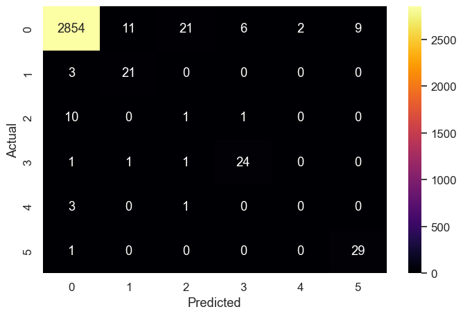
The color scale of the heatmap indicates the magnitude of the values in the matrix. In this case, the darker the color, the higher the number of predictions. This visualization helps us to understand the performance of the model and identify areas for improvement.
Here are a few things that we can learn from this matrix:
- The model made a total of 2902 correct predictions and 67 incorrect predictions.
- For the “No Failure” class, the model made 2854 correct predictions and 29 incorrect predictions. The majority of the incorrect predictions were false negatives.
- For the “Power Failure” class, the model made 21 correct predictions and three incorrect predictions.
- For the “Tool Wear Failure” class, the model made 1 correct prediction and 1 incorrect prediction.
- For the “Overstrain Failure” class, the model made 24 correct predictions and 2 incorrect predictions.
- For the “Random Failures” class, the model made 29 correct predictions and 4 incorrect predictions.
- For the “Heat Dissipation Failure” class, the model made 29 correct predictions and 1 incorrect prediction.
Overall, the model seems to be performing relatively well, but it is making a lot of false negatives for some classes.
Cross Validation
Finally, we perform cross-validation on the training set using the “cross_validate” function from scikit-learn. Cross-validation is a technique for evaluating the performance of a machine learning model by training it on different subsets of the data and evaluating it on the remaining data.
In this case, we will train and evaluate our model 10 times using different splits of the data (specified by the “cv” parameter). We also specify that the evaluation metric should be the weighted f1-score (specified by the “scoring” parameter). We then pass the weight array for the training set to the classifier.
The “cross_validate” function returns a dictionary containing various evaluation metrics for each fold of the cross-validation. We will convert the dictionary to a DataFrame and create a bar plot using the plotly express library to visualize the results. This helps us to understand the consistency and stability of the model’s performance.
# cross validation
scores  = cross_validate(xgb_clf, X_train, y_train, cv=10, scoring="f1_weighted", fit_params={ "sample_weight" :weight_train})
scores_df = pd.DataFrame(scores)
px.bar(x=scores_df.index, y=scores_df.test_score, width=800)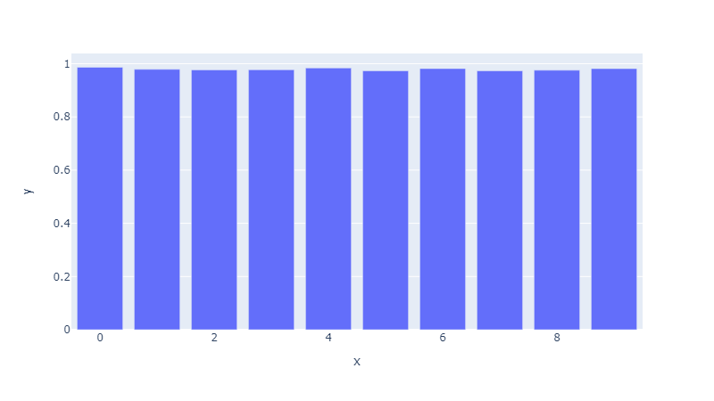
The model performance remains consistent across all folds.
Summary
In this article, we have presented the concept of predictive maintenance and demonstrated how organizations can use this approach to improve their maintenance cycles. The second part of the article provided a hands-on tutorial showing how to implement a predictive maintenance solution for predicting different failure types of a milling machine. We trained a classification model using the XGBoost algorithm and sensor data from the machine.
While the model demonstrated good performance overall, we observed that it was not able to predict all classes with the same level of accuracy. This suggests that there may be opportunities to improve the model’s performance. One potential approach is to balance the dataset by up or down-sampling the data to achieve a more even distribution of classes. By doing so, we can mitigate the effects of class imbalance and potentially improve the model’s predictions for all classes.
By implementing such a predictive maintenance approach, organizations can improve their operational efficiency and ensure the smooth running of their machinery.
I hope this article was helpful. If you have any questions or feedback, let me know in the comments.

Sources and Further Reading
There are many books available on the topics of IoT and predictive maintenance. Here are a few recommendations:
- An Introduction to Predictive Maintenance by R Keith Mobley
- Predictive Analytics: The Secret to Predicting Future Events Using Big Data and Data Science Techniques Such as Data Mining, Predictive Modelling, Statistics, Data Analysis, and Machine by Richard Hurley
- Stephan Matzka, Explainable Artificial Intelligence for Predictive Maintenance Applications, Third International Conference on Artificial Intelligence for Industries (AI4I 2020)
- David Forsyth (2019) Applied Machine Learning Springer
- ChatGPT was used to revise certain parts of this article
- Images created using Midjourney and OpenAI Dall-E
The links above to Amazon are affiliate links. By buying through these links, you support the Relataly.com blog and help to cover the hosting costs. Using the links does not affect the price.


could you suggest any ideas on areospace industry problems
Hey Florian,
sorry, I see that you have done the testing further above, my bad.
I believe that your model is still kinda condition based. I don’t think your model is telling the user ahead of time when a potential failure will occur.
Regards
Alex
Hi Florian,
I liked your article, however I don’t see where you have actually done the prediction testing with your actual test data. From my understanding the cross validation function automatically splits your data into train and validations portions so you can do the hyperparameter tuning. Once you are happy with the results of the crossvalidation you can finally check it one more time with your test data.
regards
Alex